
Claude Scorecard: PHP Blog CMS
As a part of my research on the effectiveness of Claude and coding with AI, it was imperative that I actually try it for myself and document my observations along the way. I needed to start with something simple and familiar to compare Claude’s decison making and approach with my own.
I decided to make a simple PHP blog with a CMS. I used both a free and paid account to see if I would get different results.
Prompt:
Create a lightweight PHP blog with a CMS that allows an administrator with a username and password to add, manage, and delete posts and images.
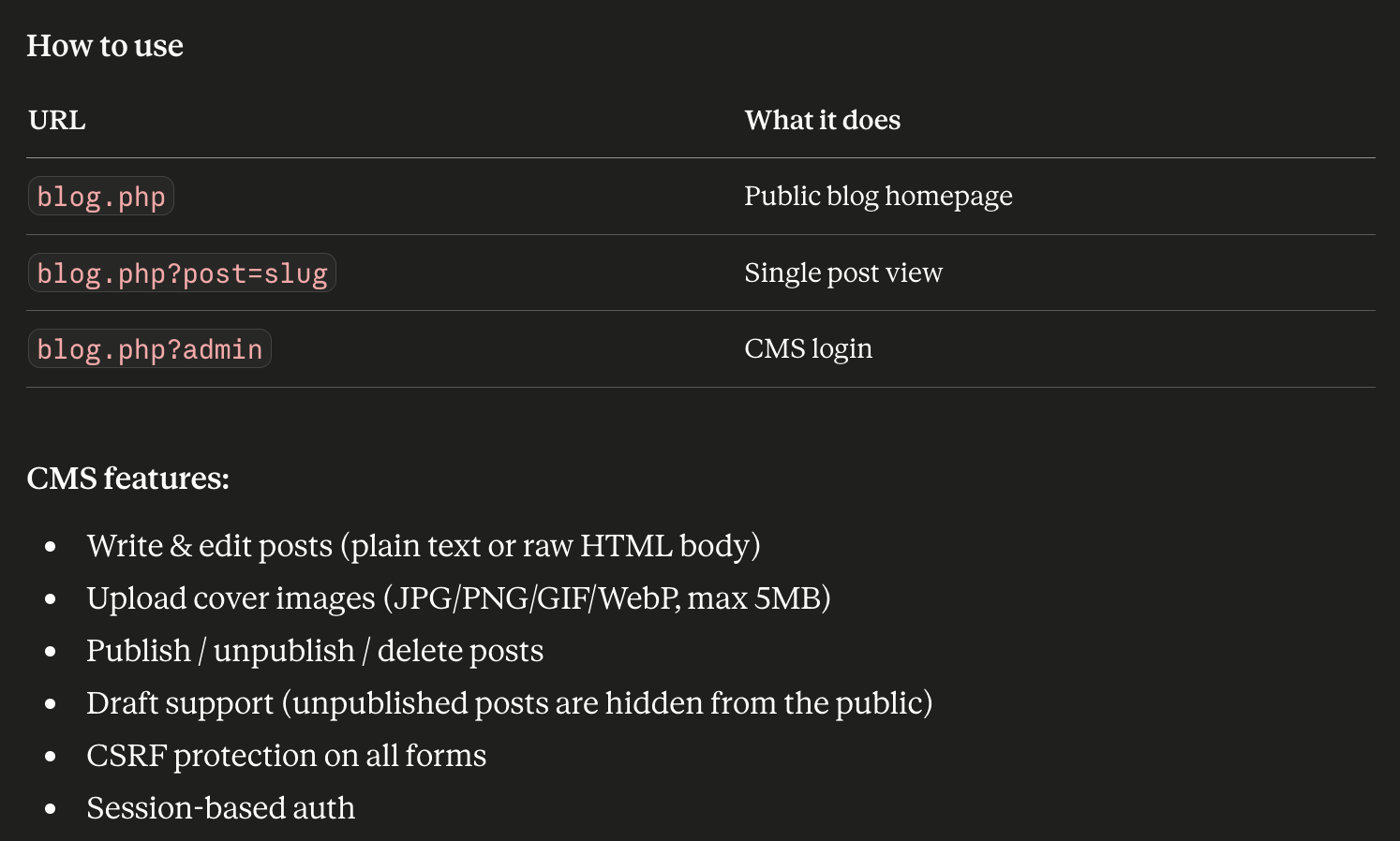
Free Account:
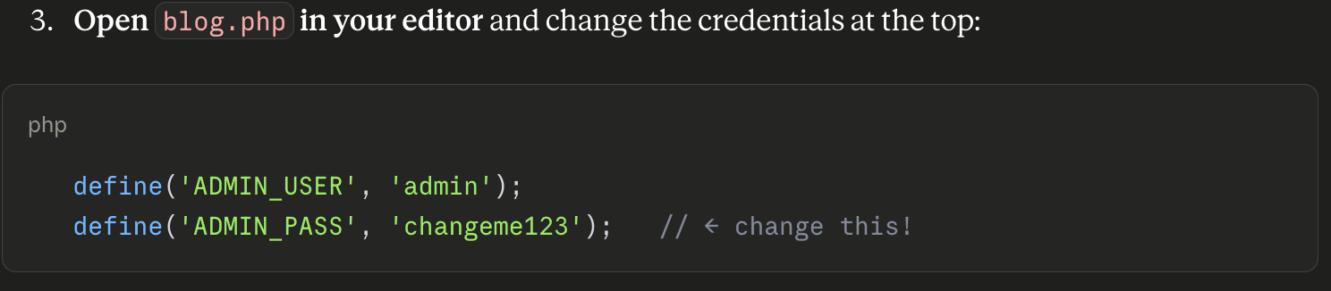
Claude created one single PHP file (blog.php) that required the user to change out the admin credentials manually:
Paid Account, using agentic Cowork mode
21 files were created and organized. CMS files were organized into /cms, /uploads, /templates, and /data directories.
Observations
There’s an obvious advantage to the Coworking mode. Claude defines Cowork as a mode that has access to your local files and can write and organize files through prompts.
The free version initially created a single PHP file to write everything to, including the admin panel and credentials, which is much less secure than keeping it in its own directory:
I had to adjust my prompt to split and organize the files to be more secure and easier to manage. The single file makes it difficult to make edits due to its size. The split files make it easier to change files and handle errors in isolation:
In Coworking mode, the initial prompt instinctively split the files into properly organized folders with proper file names.
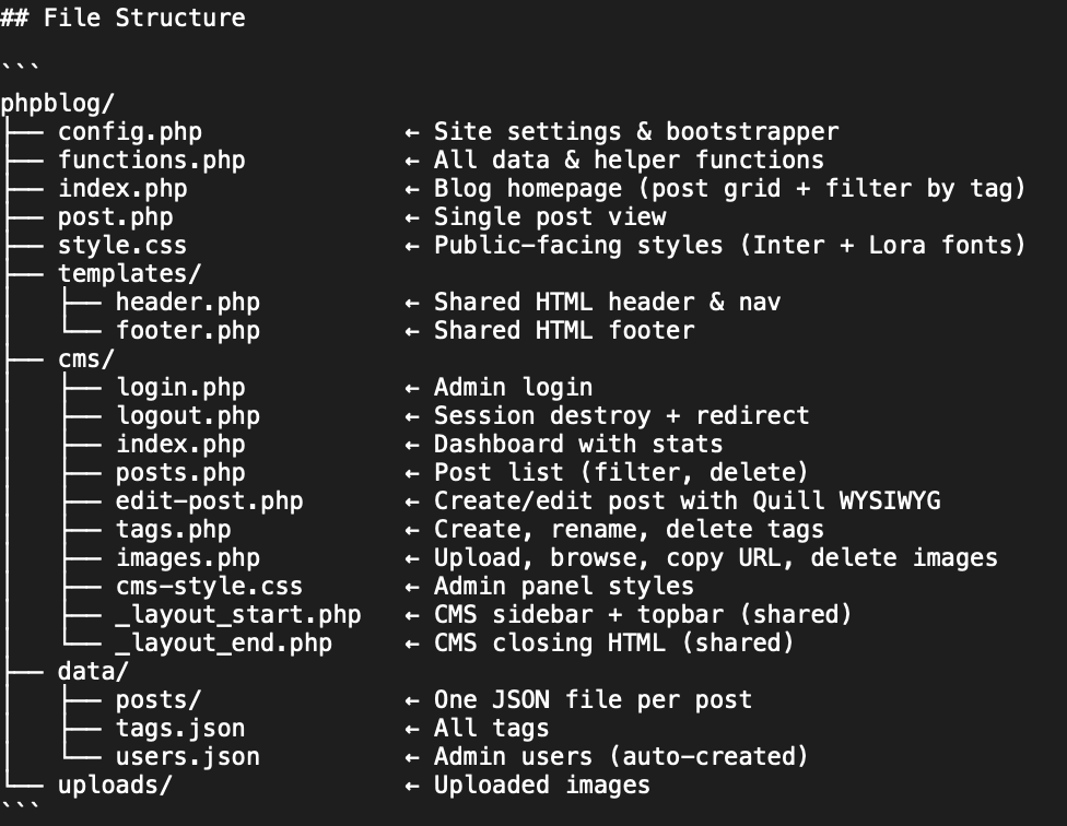
The cowork version has dedicated files for functions, CMS, frontend and data. There is a proper login and logout page. The admin uses a hash for the password, which is a much better option than simply defining the literal password in blog.php in the free version.
With the Cowork version being that much better that much faster, I went ahead and used this version as the basis for the rest of my build.
Results
As specified in the file structure, the end result was a fully-functioning blog complete with:
Tags
Multiple templated views - index view, tag view, single post views as separate templates
Image manager — the ability to upload, delete, and copy URLs for uploaded images
WYSWIG Editor - Quill.js editor for posts
User Experience
Where AI gets most interesting is in its UX decision making. Though I found the CMS to be very functional and a CMS is not exactly the best canvas for creativity and innovation, I still found some interesting details in the build:
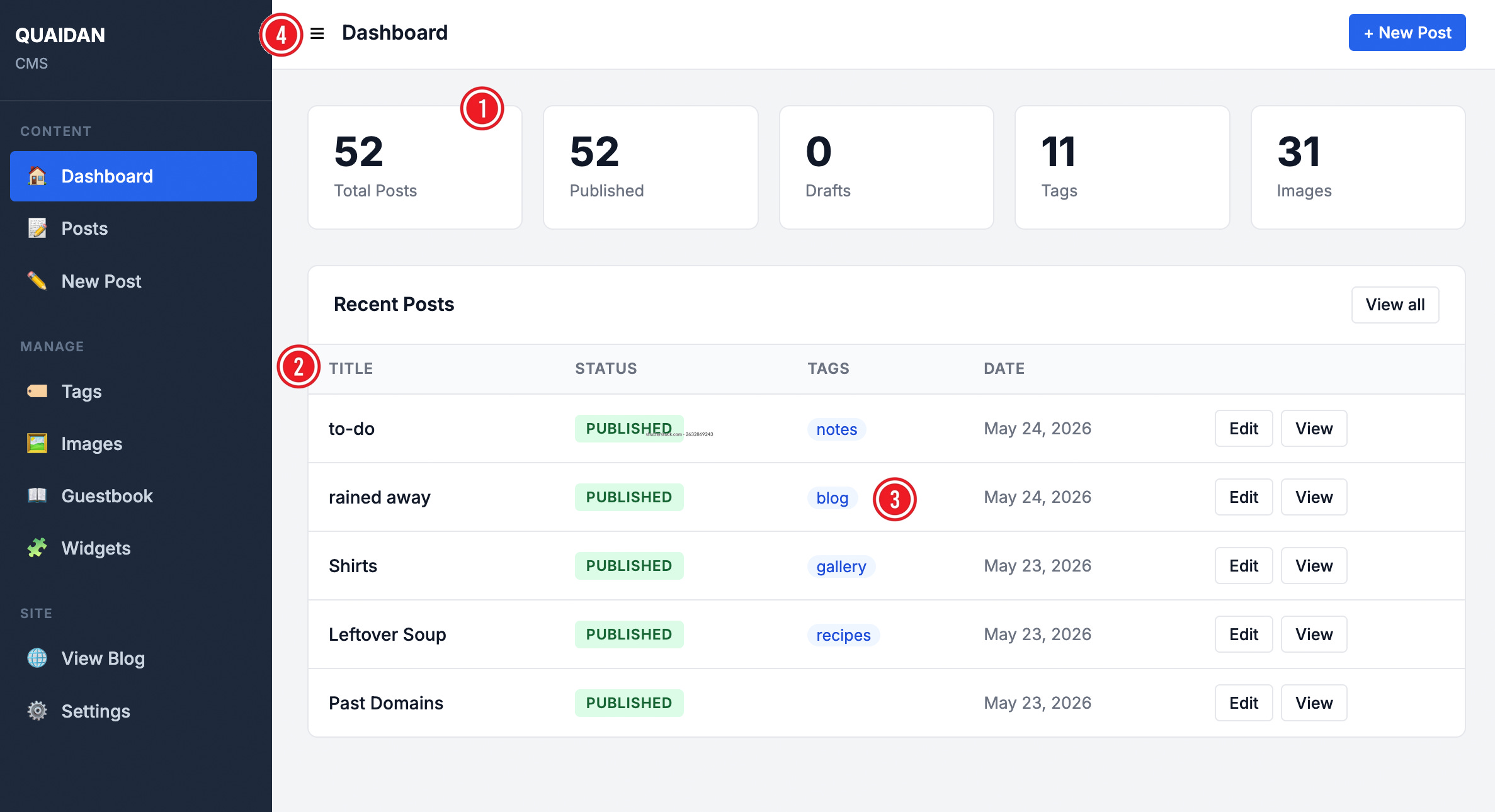
The summary cards on the main dashboard are not linked to anything. Each of these cards can be directly linked to some deeper aspect of the CMS to make these cards more usable.
In all list views, headings are not sortable. There is no select option that could allow a user to bulk delete, change status, or apply tags to several posts at a time.
The tags are not linked. This is a very small detail and I could see why Claude skipped out on providing this function, but this could often serve as a shortcut for some users to go straight to tag management.
The hamburger icon next to the Dashboard title is not a button, but just an icon. This icon does not do anything— it does not collapse the menu as you may think it does. Even as an icon, it does not match the icon for the same page in the left navbar. Very curious why it’s like this.
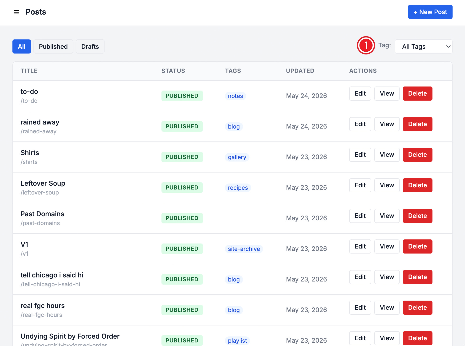
The Posts link in the left navbar takes you to a full list of all posts. It suffers from the same issues as the shortened list from the dashboard, where posts can not be selected, tags cannot be clicked, and headers cannot be sorted.
I had to add a tag filter in a subsequent iteration. The initial build did not include this dropdown and the more posts I made, the more I needed to view and reference tags, as I was also using this CMS to manage individual posts over time as pages.
When writing an article, there is a right hand sidebar that greatly resembles the Wordpress panel for the same functions.
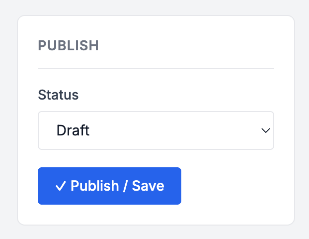
The Publish card allows a user to save a post as a draft or publish as an article. The dropdown allows you to select your option, but the button does not change based on the condition selected by the dropdown. Instead, the button is serving double duty for both statuses, which can be confusing for the user. It does not take much code to conditionally show a “Publish” button for the “Publish” option and “Save” for the “Draft” option.
The checkmark that precedes the button label is also confusing. I read this as “this article has met this condition” — but there are two conditions and this is also false. The checkmark doesn’t appear after a save/publish, it is shown by default.
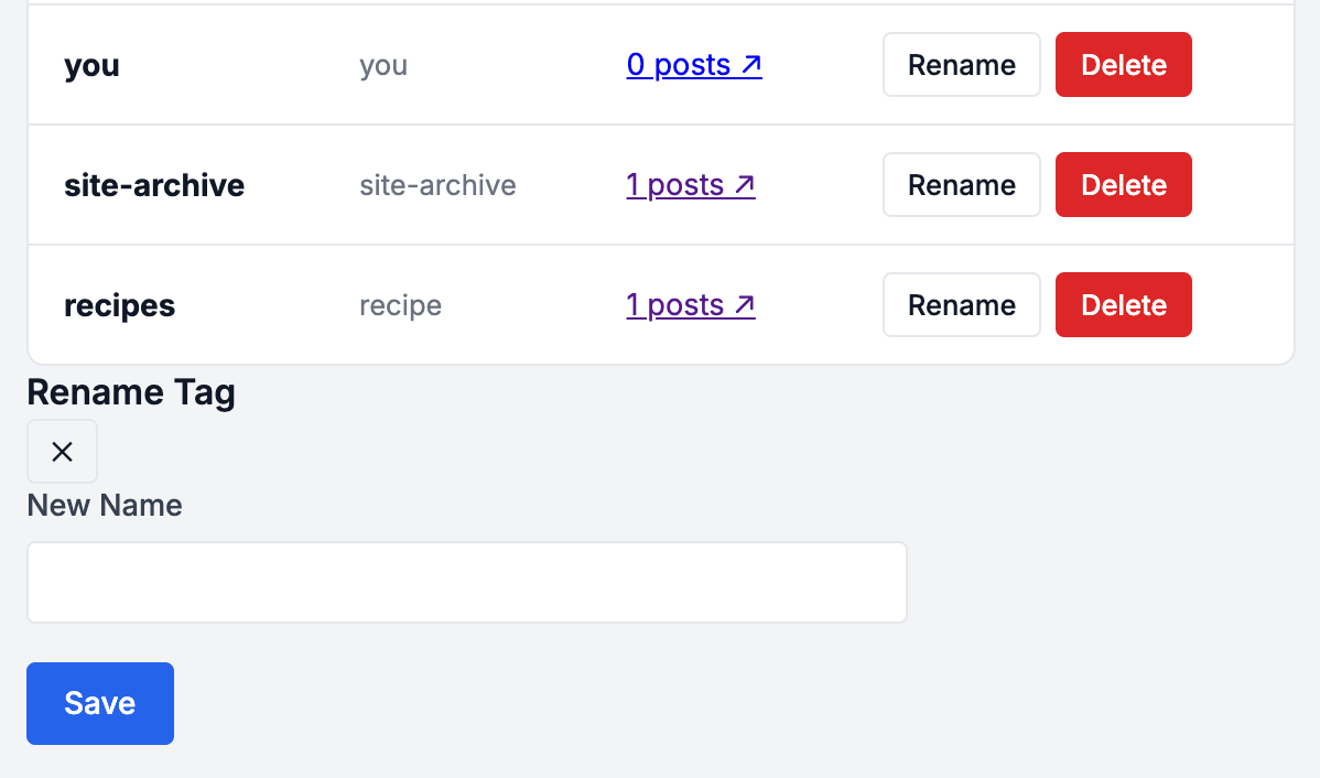
Another UI oddity is the Rename Tag feature, which is a persistent field stuck on the bottom of the tag list.
The initial and only state of the field is labeled “New Name.” The X element under the Rename Tag heading does not do anything. The Save button shows for all states, even when a tag has not been selected for renaming.
Clicking the “Rename” fills the New Name field with the former tag name. The user then types in the new name and clicks “Save,” which is also a very strange interaction. After selecting a tag, there is no indicator of the tag selected, especially if the user is supposed to type over it.
This field should not show at all when a tag has not been selected. It would also be better if the field shows in the same container as the tag being changed. If a user has hundreds of tags, the field would be buried at the bottom of the list depending on its pagination settings. This by far is one of the strangest interactions in the entire CMS.
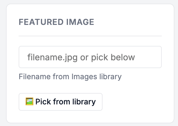
Also located in the post editor is a Featured Image module, modeled closely after a similar feature found in WordPress.
The issue for this module and the WYSIWYG editor for this CMS is that it is only capable of working with existing images. New images cannot be uploaded to the post. The user has to leave the screen to manage images and refresh the post editor to pick a new image.
The above image shows the only option for the Featured Image being “Pick from Library” rather than Upload New or similar.
Although this is easily solved by a follow-up prompt, the initial build lacks crucial intuitive features when it comes to post editing and media management.
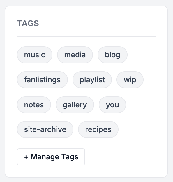
Similarly, the tag section of the post editor does not allow the user to add a new tag. The list shows existing tags and a link to Manage Tags. There is no option to add a new tag to the new post on the same screen. The same flow has to be followed as a new image— the user has to leave the screen and refresh the post to see their newly added tag.
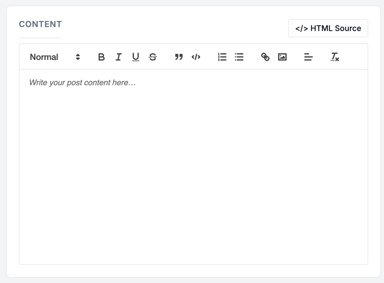
Finally, after using the initial build, I found myself frustrated with the inability to access the source view of a post. I needed this for Bandcamp and Youtube embeds in particular, which I would imagine would be very common elements for many users’ posts. Images are also hard to deal with in this editor, as the user can simply reference an image but cannot dictate any other property, such as its size and alignments.
The HTML Source button was added in a subsequent prompt to alleviate this, but was definitely not part of the initial build.
Other features added after the first iteration:
Since the initial build, I have added the following features to the CMS to improve it:
Widgets: Similar to Wordpress’ widget manager, I added widgets to include in my template and manage in the CMS, which cut down on the amount of editing needed on header and footer.php
Guestbook: For my particular build, I wanted a Guestbook and added the administration to the CMS
Body tags: To help with more specific styling needs, I borrowed another feature from Wordpress that appends the post slug to the body tag.
Conclusion
Overall, I think Claude did a very good job of creating a PHP-based blog and CMS. I would give the end result an A-, but the observations mentioned in this article have greatly reduced the user friendliness of the overall application and the improvements mentioned are standard improvements that exist in other applications Claude could have referenced like anything else. I had to lean on my existing knowledge more than I thought I would in this build.
It seems like Claude was conservative about user-friendly features and only provided what was necessary for the build. The fact that it took me additional prompts to add things like HTML source is a sign that Claude inherently designs code for a less technical audience and reserves such features for those who know to ask for it.
Although it makes sense that a free version of Claude would generate a single file, the fact that the client does not make mention of the risks involved with a single file CMS stuck out to me. I knew what to look for and what concerns to have when I saw the file structure, but worry about those who don’t.
For anyone who is looking into AI to generate code, it is imperative that all code is evaluated for security and user-friendliness. I think my build could have improved in those ways the most and believe that no matter what code you’re looking at — human or AI-generated, security and user-friendliness can always be improved upon — and those improvements are not always necessarily purely code based.