
Deus UX Machina
A human evaluation of a machine-generated intranet

Help, my boss discovered vibecoding.
On the one hand, he’s been able to do small tasks that I’ve put off for months. On the other, he’s been making one UX hellscape after another and unleashing it on our teams.
Thankfully, he knows human intervention is needed to save him from his own slop. He’s asked me to take a look at an intranet portal he’s designed for our employees:
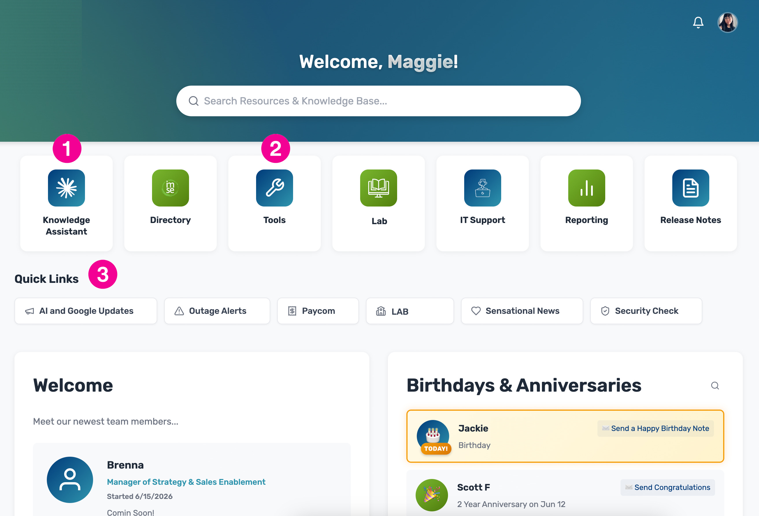
As much as I’d like to spend the next few paragraphs tearing the generic design and iconography a new one, the ask was to improve the user experience from a structural lens rather than an aesthetic one.
That said, marked in pink are areas of UX concern:
Horizontal, non-persistent navigation:
The main screen presents the navigation as a horizontal set of buttons that lives in the same container as the content of the page. Not only is there no delineation between nav and content, but the navigation lives in different places on subsequent screens.
The lack of a persistent navigation doesn’t allow users to navigate freely from section to section. Users must use a back button in the app or on their browser to return to this main navigation to move on.
Developers should expect that no two users want to do the same thing in the same order. Navigations should be designed to allow users to go from any place to any other place freely. Subsequent screenshots in this article will demonstrate this further.Unclear Navigation Items
There is a navigation item called “Tools.” Technically, everything else in this navigation could be considered a tool. The navigation and site are not organized in a way to also hint at what these tools could be. The ordering is also suggests that Tools will be more frequently visited than the items that follow, which would not be true for most users.
When looking at the size of the navigation in the screenshot, it’s possible that Tools is just a place to put things that don’t fit in the main navigation, which isn’t what a Tools link should imply.
The placement of this menu item doesn’t follow UX conventions where tools and other application-related functionality is grouped together later in the item list.Quick Links
To support my former argument that this navigation was getting too big, a Quick Links section appears under the main navigation possibly because there wasn’t enough room for them.
There is a link in the main navigation called “Lab” and another in this section of the same name. These links go to different places entirely.
It is difficult to discern why these links are Quick Links. This section seems to be named this way because there is no other reasoning behind this grouping. If anything, Quick Links should be a customizable bar for the user to add their favorite sections like shortcuts on a desktop. This would be more useful to the user than the section as it appears now.
The application content does not lose its integrity if a thin vertical navigation bar was added instead and appears in the same place and design on all subsequent pages.
The navigation could benefit from a subnavigation with parent grouping to keep the menu concise and clear.
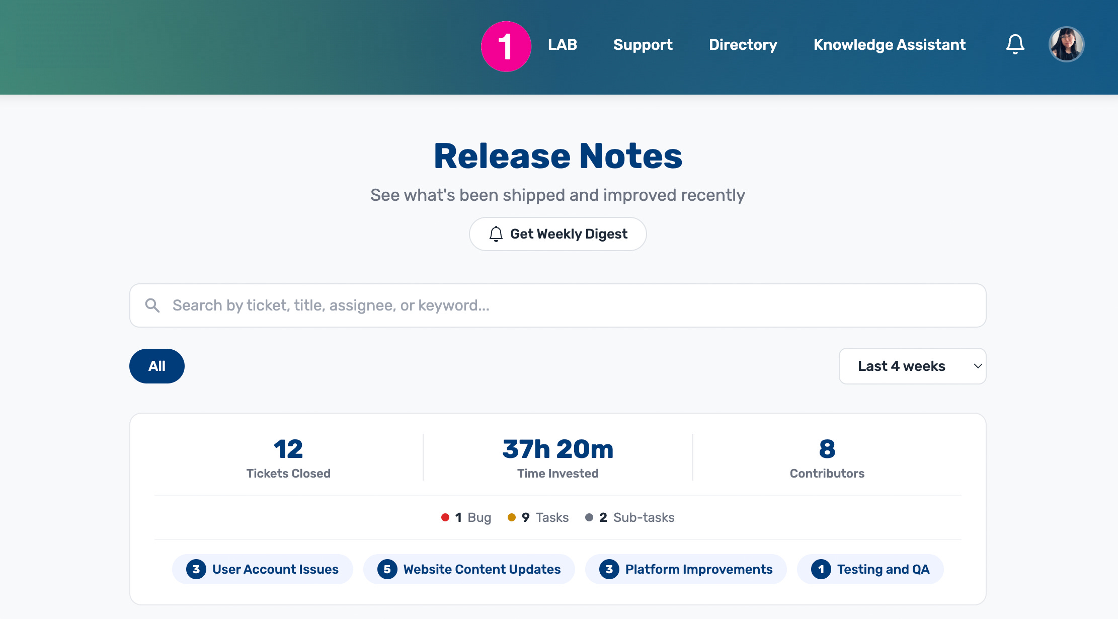
We move on to a subsequent screen to demonstrate the aforementioned irregular navigation.
Inconsistent Navigation:
Some, but not all items from the main screen are shown in the top navigation on other screens. There’s no reason not to use this section on the main screen in the same way, as this same space exists on the previous screen too.
Notice some links, like Tools, is missing from this navigation. Knowledge Assistant was in the first position on the previous screen but the last position on this one.
Inconsistencies like this make it harder for users to develop the necessary muscle memory to efficiently navigate the application and loses usefulness. The missing links on this screen also prevent the user from going anywhere they want, which could promote frustration too.
The last major repeated offense I found throughout the application was crowded “filtering” on lookup screens like this one:
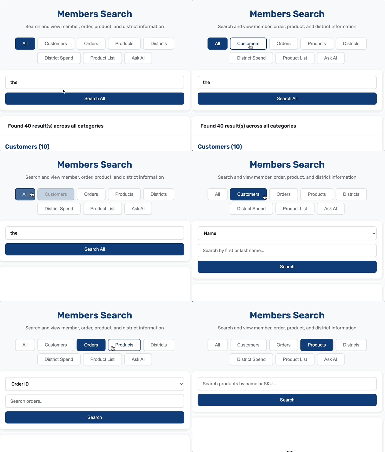
This screen is designed to help Customer Service search through an application called Members to look up customers, orders, products, districts, and products.
The button bar above the results list correctly categorizes what users can look up using this tool.
The “All” option allows users to view results across all categories, which are then organized in the results list by category.
What is confusing about this interaction is that the existence of “All” implies that the subsequent buttons are filters of the same content. You will see in the gif that there are 40 results in multiple categories.
From here, I expect that clicking the “Customers” button on the filter bar will then filter my 40 results down to the 10 customers that appeared on the View All list.
It does not do that. Instead, I am asked to search again by a different term type. Navigating back to View All cleared the search entirely if I happened to make the mistake and want to return to my results. I have to perform the search all over again to get back to my original list.
Not only are there too many categories in the button bar, they don’t function as expected when engaged. If the View All search bar accepts all types of queries for all these categories, the most modern approach may be to present the search bar by itself and then present filters after the search has been performed.
The instructions could then be moved into the search field to help users understand what they can search.
There’s also a part of me that sees the Ask AI button and wonders why anyone would want to use the search as it’s designed at all if AI does the same thing as the View All search probably does.
Ask AI is also not a filter category but it is presented in the list as though it is one. It should be styled differently and moved to better communicate that it has a different function than everything else next to it.
Conclusion
It’s very possible that many of the observations made above come from poor prompting or a prompter that does not have app development or UX/UX experience. In the hands of someone with previous experience, it’s very possible that the output may have addressed all of the issues above in meaningful ways.
And that’s to say that Claude or whatever AI being used is not that, nor does it try to be. Nor should it.
If anything, this exercise proves that uneducated designers will generate uneducated designs and that AI is as good as the person who prompts it, meaning that skill is not a dead art.
Will AI get better at interpreting and making assumptions based on our uneducated prompts? Sure, but the quality of those assumptions will always be tied to the knowledge of the asker. The more knowledge, the better the result.
Furthermore, if AI is going to encourage more uneducated users to design UI systems, more poor systems will be introduced to the pool, which will eventually swing the quality of these designs closer to a lower average and become part of the majority that AI pulls from. And mediocrity shall begat mediocrity, etc.
TLDR:
Great news for mediocrity lovers.